As a certified color analyst and image consultant, I have a lot of thoughts about “online color analysis.” You’ve probably seen it—filters that supposedly show your season, quizzes to determine your undertone, tips and tricks to figure out your color palette. But here’s the thing: color analysis doesn’t really work like that.
Wouldn’t it be great if there was a cheat sheet? An answer key that takes all your features into account and spits out your season? Unfortunately, it’s just not that simple.
I’ve studied multiple color theories, and here’s what I’ve found: color changes the moment you see it on a screen.
Why should you listen to me?
Color analysis has been part of my life for as long as I can remember. My mom and “aunt” (a close family friend) started a fashion consulting business back in the ’80s, when color analysis was all the rage. Think “Color Me Beautiful,” “Beauty for All Seasons,” and an explosion of other books and certification programs—my mom and aunt were certified in all of them.
My aunt was a former model and instructor; my mom, still one of the best color analysts I know, scored near-perfect on color perception tests. I learned from the best and eventually became certified myself through Color Me Beautiful, Sterling Style Academy, and AlmaStyle.
I had a major problem.
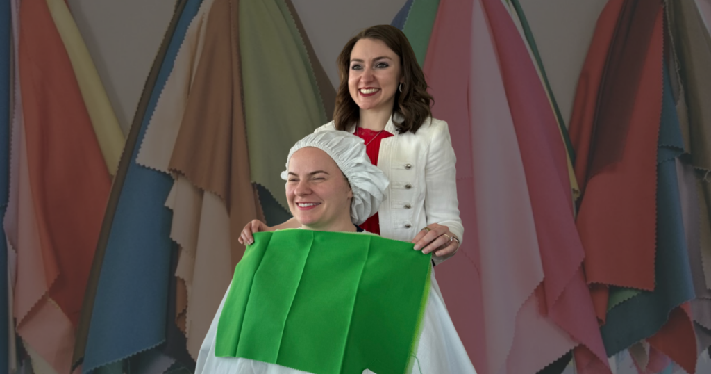
When I started my business, I built it around the original Color Me Beautiful color theory—the classic four-season approach. Unlike systems that break seasons into three subcategories, that approach focuses on finding your absolute best colors without boxing you into a narrow subset. To accomplish that for my clients, I needed my own set of drapes, modeled after the original colors Color Me Beautiful emphasizes.
I spent weeks sourcing fabric—120 swatches in total—i.e., 30 for each season—selected specifically for their hue, chroma, and temperature. (I swear, JoAnn Fabrics couldn’t wait to get rid of me!) These were more than just pretty shades; they were carefully curated to show how each season’s palette transforms your overall appearance.
But I had a problem.
How do I give clients something to take home so they can apply what I’ve taught them when choosing their clothes and accessories day to day?
I wanted to make pocket-sized swatch sets. But after trying several so-called automatic cutters, I realized that slicing fabric, attaching it to cardstock, and assembling wallets by hand was far too time-consuming—not to mention a fast track to carpal tunnel.
So I looked into digital options. I tried photographing the swatches, but the colors never stayed true. Lighting, angle, distance—every variable changed how the fabric looked. Next, I tried color-matching apps to identify the hex codes of the colors in my swatches. Same problem. The hex code shifted depending on all the same variables.
Eventually, I had to find each color manually. I used a hex code site, dragged my mouse to match digital color to fabric. Then I printed it and compared it to the physical swatch. If it passed, I’d compare it to professionally printed versions, as I’d be printing them professionally on branded take-home stacks. Every step had to be checked. It required hours and hours upon hours (Did I mention the countless hours?) of work—because the ugly and inconvenient truth is: color changes the moment it hits a screen.
The apps don’t lie... or maybe they do.
To make matters more challenging, the camera on TikTok, Instagram, and your phone’s camera app—none of them are the same. Even when you select “no filter” on TikTok, it subtly smooths imperfections. (Not gonna lie, I love how I look on that app.)
Each platform uses different image processing and color correction algorithms. They mess with exposure, white balance, color profiles—you name it. And then you have to factor in the hardware differences from one phone to another.
I tested every popular color analysis filter on TikTok just to be sure. On each app, I looked slightly different. I compared the shade of my lipstick across platforms and noticed the warmth levels varied noticeably. And that’s just the lipstick—don’t even get me started on the rest of my face.
When I tried to figure out my season using those filters, I could barely see a difference between them. Now imagine how confusing that would be for someone without color training.
At the end of the day, color analysis is a science and an art—and screens, filters, and apps can’t replace the trained eye and the magic of seeing color in real life. It’s not about a one-size-fits-all quiz result or a trendy filter—it’s about discovering what truly enhances you. And that can’t be automated.
Still not convinced? Let’s not forget the dress. You know the one—blue and black or white and gold? In real life, it was actually blue and black. Wild, right? But lighting and camera capture made it look completely different to half the world.
It’s a great example of why relying on online color analysis tools will lead you astray.
I rest my case.